About our logo
The process of creating a suitable logo for an organization can be excruciating. Heck companies have spent millions with Ad Agencies and Designers to create an image with just the right look and feel.
We didn’t do any of that…
We just kicked it around for a little bit. Did some research. Talked a little more, and came up with the Owl of Athena (sometimes called the owl of Minerva) for our symbol. Here is a little bit of the process that got us there.
We hope that at the end of this journey, you feel like we do: that this logo captures who we are, and what we are about.
Early ideas:
Just kicking some stuff around. Can you see how the “G” logo grew out of the Spartan helmet?
In the beginning, just seeing what the Greek Alumni Association name would yield. GAA? Greek being the key word. Alumni Association being secondary with the double “A’s” yielding some design possibilities.
Slowly the “G” helmet started to grow. The “A’s” being the eye holes of the helmet inspiration. I love a “negative space” logo, and this one had some of that. Unfortunately, it was a little more “war like” than I think we needed, and I wasn’t sure if the ladies would think this logo was as “bad ass” as I thought the men might.
…Further thought,
and taking a different approach
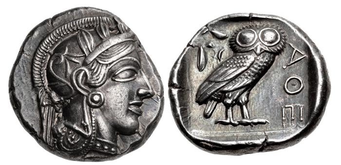
The more I think about Greece and greek stuff, and what we are trying to do with the Greek Alumni Association, the more I got away from the warrior symbolism and the more I dug into Philosophers and their associated icons and symbols. I want to capture what it meant to be Greek at that amazing time in history and more specifically dig into the big topics a greek Philosopher might be considering. Ideas the greatest minds of the times wanted and talked about from their places in the public square. You get scrolls and the Parthenon, togas and a lot of stone busts of men’s heads as images. But the greek tetradrachm coin is what most jumped out at me.
the Greek Tetradrachm,
The tetradrachm was the most popular and circulated coins in the ancient world. It featured Athena on the front and this owl on the back. Both with wide eyes. Both symbols of strength, wisdom and courage. The olive branch in the owls mouth illustrates its wisdom, because it’s capable of war and strength, but always prefers peace and love.
Some other things happening at that time:
Some clips about this coin and Greece at this time in history.
So then a little more refinement to make it not a coin…
Collecting info
Doing research
Fooling around with other design concepts
I also found this quote in Wikipedia on the Athena/owl combo:
“Philosophy, as the thought of the world, does not appear until reality has completed its formative process, and made itself ready. History thus corroborates the teaching of the conception that only in the maturity of reality does the ideal appear as counterpart to the real, apprehends the real world in its substance, and shapes it into an intellectual kingdom. When philosophy paints its grey in grey, one form of life has become old, and by means of grey it cannot be rejuvenated, but only known. The owl of Minerva takes its flight only when the shades of night are gathering.”
— G.W.F. Hegel, Philosophy of Right (1820), "Preface"; translated by S W Dyde, 1896
I think that quote sums us up. Having the age and wisdom to see the grey in the grey. I love that: hope you do too..
This is the Owl of Minerva, the Owl of Athena logo. I like it, and what it says about our organization. Hope you do too.
This was an early draft. We refined it, lean it up, and make it all professional style.
Athena (the owl) is pretty flexible, and can do lots of things Greeks do.
…even skateboard.
2023 Revisions
The Bloomsburg Greek Alumni Association Board, at the advice of printing companies and publishers, made some changes to the original logo, so that it would be easier to make garments and produce other BGAA related swag and products. As a result, this is the version of the logo presently being used.
As will all things creative, it’s a never ending process, and one that we hope future versions of the board will keep fresh and vibrant.


